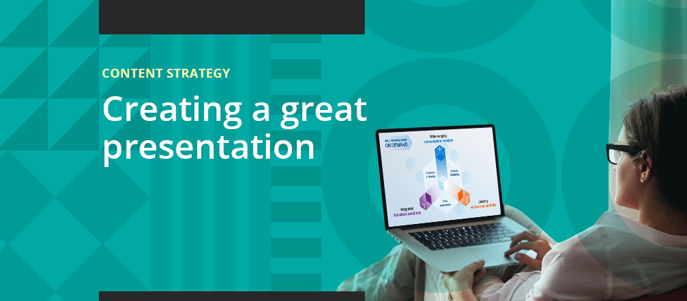
CGI Interactions
A blog about interactive communications for marketers, designers and developers

Keeping the Guesswork Out of the User Interface

February 17th, 2012 . by Benjamin Robbins

A recent review by Matthew Panzarino of the iOS app Clear has brought to light the value of User Interface standards. Panzario makes the case for the UI of Clear:

“Clear takes a different tack, as its interface lacks any standard buttons and operates completely through gestures, taps or direct manipulation of the list items on the screen…Frankly it’s so different from how apps normally work and offers so little assistance to those unfamiliar with gestures that the guys at Realmac and Impending, the two studios responsible for Clear, had a tough time deciding how to introduce new users to using the app. But once a user is familiar with just the basic operation of the app, they take off like a rocket using them with ease.”

While Panzario acknowledges the learning curve, the hurdle is dismissed once familiarity has set in. Yet, this type of app-centric thinking would prove daunting if applied to your entire app ecosystem. Imagine if every app you downloaded you had to figure-out how to interact and operate it. Clear has departed from the norms of app User Interface expectations at the expense of clarity. This is done under the guise of being intuitive to a gesture-based device. Unfortunately, all it has done is turned gestures into ‘guess-tures’.

I am not advocating for slavish boring design or lack of innovation. Great design is actually very challenging. It requires presenting only the most relevant of information and task options at the right moment. As well, it should be visually engaging. But most of all, it has to be self-explanatory. If you need accompanying instructions with how to use your app – especially a mobile app – you have missed the mark. I should be able to download an app and immediately begin to use it without having to try and figure out how to make it go. This doesn’t mean there aren’t options or complexities in the app. But an app shouldn’t have the added challenge of figuring out basic operation.

Here is where Clear became unclear – while leveraging gestures is native to the device it is only one component of the UI.  Text is an essential part of the User Interface. Eliminate it and you just removed an entire dimension of the application experience. The real challenge with Clear’s approach is that they are actually handicapping themselves by eliminating one of the components. Swiping to the left in one app may mean one thing and something completely different in another. But an OK button means OK in all apps because the action of pressing it is combined with my ability to comprehend the meaning of OK. The text that is part of the User Interface is essentially a nicely self-contained user manual.

User interface standards are a slowly evolving bunch. There is practical value in having them. Not having them would mean a learning curve with each app we encounter. That is neither efficient nor productive. There is a time and a place for innovation and the introduction of new standards. The pinch/zoom of the iPhone is a perfect example. But, its introduction worked because it was, and is uniform across the entire platform and not app specific. Pinching in one app does the same thing as pinching in another.

Great app UIs leave no guesswork for users. Great apps don’t require any training. Great app UIs are self-explanatory. Most importantly, a great User Interface instinctively relies on the coupling of both our physical manipulation (gestures) with our cognizant (thinking/reading) abilities. It is enough of a challenge to design a great User Interface – don’t add to the challenge by attempting to reinvent the wheel. Now go create brilliance!


Benjamin Robbins is one of the founders of AdminBridge – providing IT Administration from mobile devices. For more information visit http://adminbridge.com. He blogs regularly at http://remotelymobileblog.com


Posted in: Design Trends, Development, Mobile Design, Mobile Marketing

The Importance of a Call to Action

February 16th, 2012 . by Elizabeth

In today’s society it is easy to suffer from information overload.  Between email, the internet, and YouTube videos, the ability to focus is becoming difficult.  Our audience is often multitasking, whether it be during a presentation or in a meeting, therefore it is necessary to learn how to engage your audience.  One of the best ways  is through a call to action which allows your audience to better understand what it is you expect them to do.  A good call to action will provide focus, measure, and direction to your users.  Using active language is the best way to get your point across and to get your audience to act.

Try working these words into your material for a great call to action:

- Listen: When making a key point during a presentation, it is important to have the attention of your audience.  ”Listen” alerts your audience that you are about to make an important point.

- Subscribe: Whether it be a quarterly newsletter or a facebook post, in order to engage your audience they must click and subscribe to the content.  Asking a user to subscribe increases the opportunity for future interactions.

- Share: Social networks are continuing to grow at a rapid rate and part of the reason for this is the ability to share content with other users.  Social networks such as Pinterest and Twitter allow users to choose who they see information from.  Asking users to share your content spreads brand awareness.

- Contact Us: Reach out to your audience with a contact form as a great way to start discussions.  A “Contact Us” form tells your audience that you want to hear from them.

Whether giving a keynote presentation or creating a landing page, including a call to action will let them know exactly what it is you would like them to do.  So, please share this post on Twitter, Facebook, or LinkedIn!


Posted in: Blogging, FAQs / Tips & Tricks, Social Media Marketing

How Your Brand Can and Should Use Pinterest

February 14th, 2012 . by Kelsey

What began in 2010 as an online bulletin board geared towards wedding planning or crafty art projects has exploded into a visual social networking site with 3.3 million users, according to Compete. Pinterest’s demographic, states TechCrunch, is predominately 18-34 year old upper income women; the target audience of many marketers. Brands and businesses are taking notice of this and it’s no surprise the question on every marketers mind is “Can I incorporate Pinterest into my marketing strategy?”

Pinterest can absolutely be used as a marketing tool, but requires a thoughtful approach in order to remain true to it’s goal to “connect everyone in the world through the ‘things’ they find interesting.” Businesses should use the social network to showcase the lifestyle their brand promotes, as opposed to blatant self-promotion. This provides a great opportunity to establish your brand within a niche community and share pins with others who have similar interests. By pinning content that adds value, your followers are more likely to share by repining or liking your pins. Simultaneously, your brand will be building trust with its followers because you are engaging in the lifestyle that surrounds the brand. Build your reputation by becoming the go-to Pinterest account for pins about a topic relating to your industry.  HubSpot suggests viewing pinboards of your customers to aid in your understanding of who your customers are and what they’re interested in. Pinterest is a fantastic resource for better understanding your brand’s audience.

One of the biggest challenges CGI faced when determining the approach to our Pinterest was a lack of tangible products. However, even if your brand isn’t particularly visual, this shouldn’t hold you back from using Pinterest. To overcome this challenge, we brainstormed boards we thought would add value to our industry and be something our clients found interesting. We kept our boards visually appealing by being mindful of how we arranged our pins and how we organized the boards.  Currently Pinterest is still invite only, but leave your email in the comment section and CGI would be happy to send you an invitation to join us on this cool new social media platform.

The best advice is to simply try out Pinterest- it’s incredibly easy to use. Start small and see how your boards begin taking shape before generating a huge following. If after a month you’re generating more referral traffic, consider linking your Twitter to your Pinterest account so you can easily tweet your pins and leverage hashtags to make content more search-friendly. The number one rule, is pin things that are relevant to your business but not too promotional. In the words of Ben and the Pinterest Team “Happy Pinning.”

Posted in: CGI News & Events, FAQs / Tips & Tricks, Social Media Marketing

« Previous Entries Next Entries »


home     |     about     |     disclaimer     |     cgi interactive
© - CGI Interactive - 76 Otis Street - Westboro, MA 01581 - 508.898.2500